
One Mario Sirtori
Corporate Identity - 2018
Shiny Matte.
The aim of the project was to present the nascent ONE brand, which collects the collections of fabrics for the contract market, proposed by the famous historical manufacture Mario Sirtori. We have created a vision based on the brilliant-opaque antinomy that made the products of the catalog complementary, having on one hand the velvets with their shimmering reflection, on the other the opacity of the canvases and the Alpaca velvet. The vision was named Shiny Matte which generated the brand identity, the communicative and promotional artefacts and leaflets for the stand which then led to the 2018 Orgatec fair in Cologne.

Tone and rhythm.
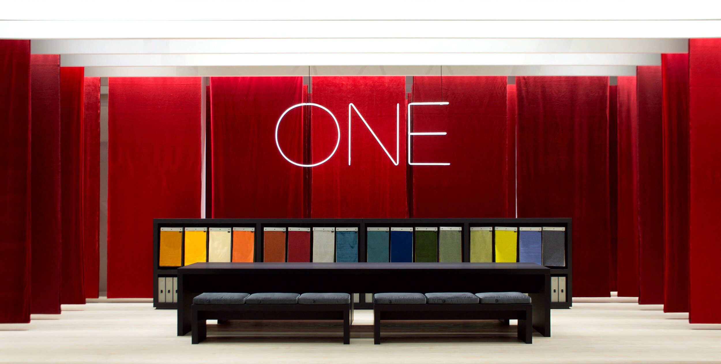
The exhibition stand project was born from the vision Shiny Matte. A space with a rectangular plan in which all the fabrics of the collection have been made to descend from the ceiling, according to a regular geometric matrix, in the tone of red. The single tone gave uniformity to the whole and highlighted the variable of the reflection and refraction behaviour of the light, playing precisely on the Shiny Matte contrast. The rhythmic cadence, the proportion between height, width and empty space between the fabrics, created a sense of almost martial solemnity.
For the floor we used brushed derulated spruce: the light wood, with irregular flaming, gave the space the status of an accomplished object, distinguished by the nature of the material compared to the context, a pedestal, simple and noble at the same time.

The layout of the space.
The arrangement of the fabrics was designed to leave a central space dedicated to meeting with customers, demonstrating samples and bargaining. The equal thickness, the matt black laminate finish, the essential geometry accentuated the ideal character of pure functionality of the furniture. On the back of the table, all the fabric ties of the collection were presented in an open compartment, focusing the visitor's attention, through the succession of colours, on the object of the exhibition. Halfway through the empty space between the end of the cabinet and the ceiling, the logo, made of neon tubes, stood out suspended. The central symmetry graphic layout increased the perception of the metaphysical absoluteness of the stand, a perception that we wanted to lead the visitor to the solid reliability of the brand.

Plan the route.
The vision Shiny Matte has shaped all the communication artefacts in preparation and during the fair. From digital communication, via newsletter and website, to promotion on social networks through the graphics of appropriately designed advertising campaigns.


Matter of etiquette.
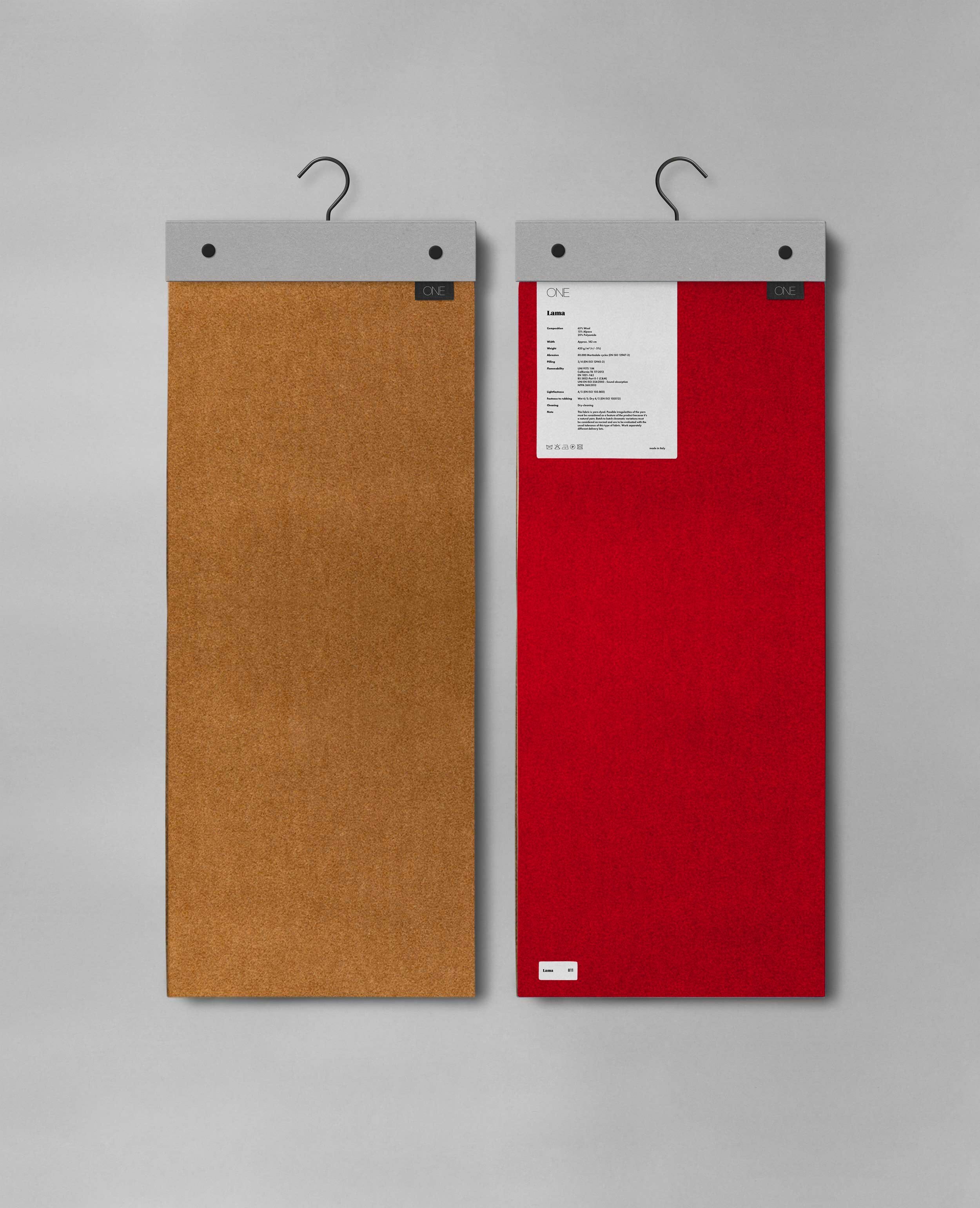
The graphic choices that determined the architecture of the stand led us to design the fabric pullers. Large tirelle were produced for display purposes, and small tirelle to be left to customers as samples. The absolute simplicity of the object, the use of a consolidated and basic form has allowed us to focus attention on materials and colour contrasts. The result is an extremely accomplished essentiality. The introduction of a textile label with the logo, similar to that used in clothing is a detail that gives recognition and conveys the idea of manufacturing expertise.