More Cosmetics
Brand Identity & Packaging Design - 2015

The birth of a brand.

The process of designing a new brand of cosmetic products was born from the request of a Swiss manufacturer willing to open a trade on the Hong Kong market. The design activity focused primarily on the creation of a brand identity, that is, of that complex of images, colours, graphic and aesthetic choices that represent the brand in the customer's experience and memory. This brand vision is expressive of tangible and intangible values ​​that shape all the brand's artefacts and reach its commercial operators and the public, offering the perception of a coherent visual unity. Therefore, packaging, graphic product promotion tools and institutional graphics derive from this vision.

 
BRA1b.gif

Graphic guidelines.

We have built a dossier that presents the brand identity project and includes a study on naming, the choice of fonts and colours representative of the brand identity, the logotype and logogram proposals, the writing of a payoff. The dossier presents in detail the rules for the use of these graphic and textual elements on the various possible supports.

TOT1.jpg
 

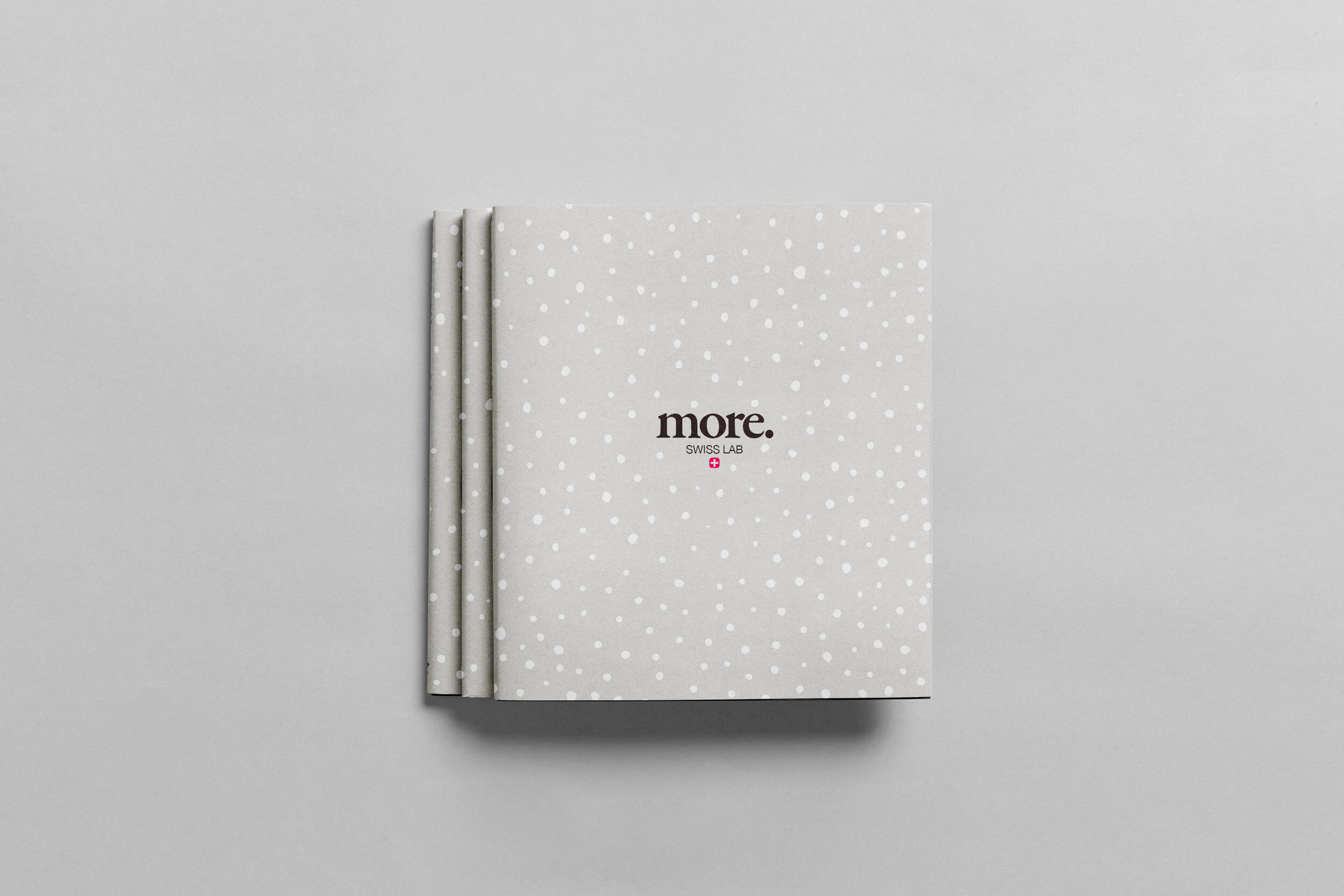
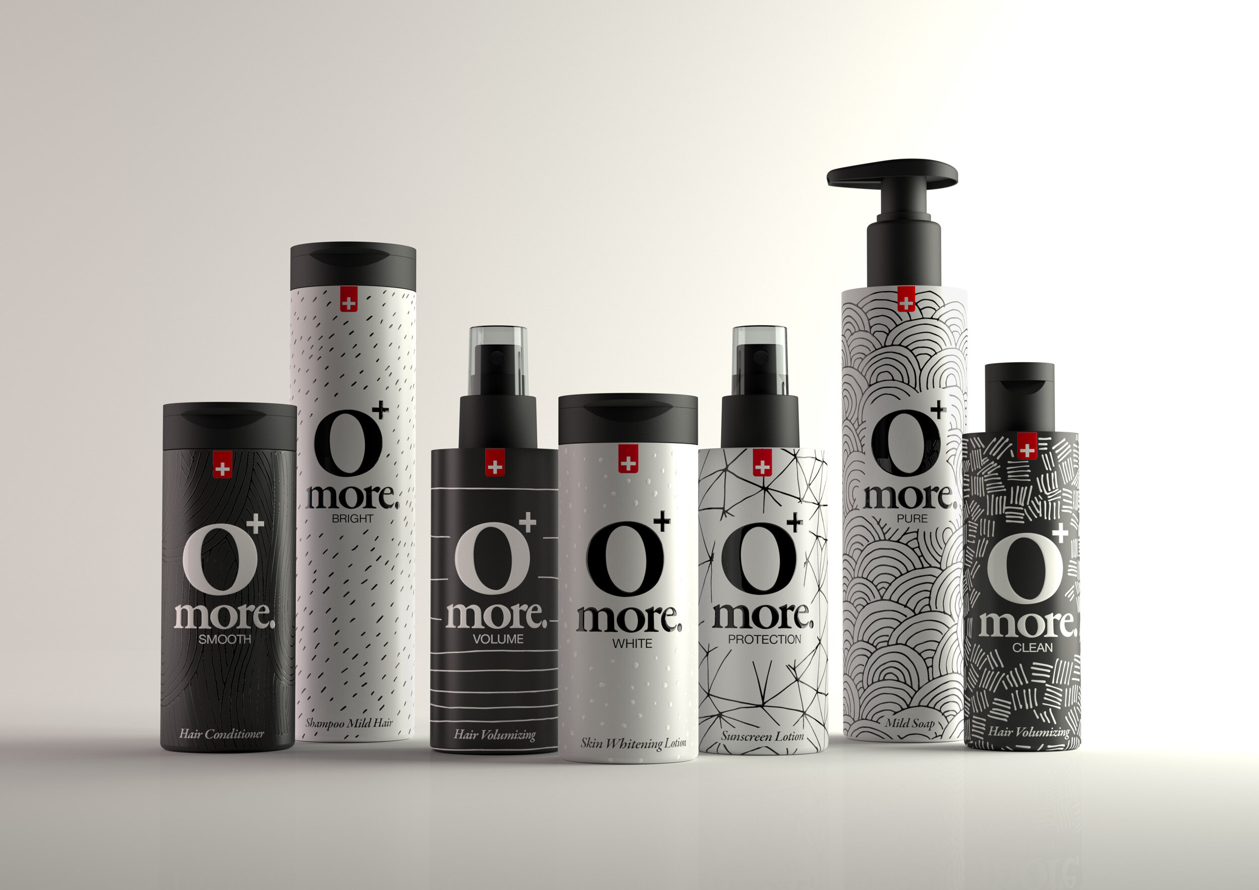
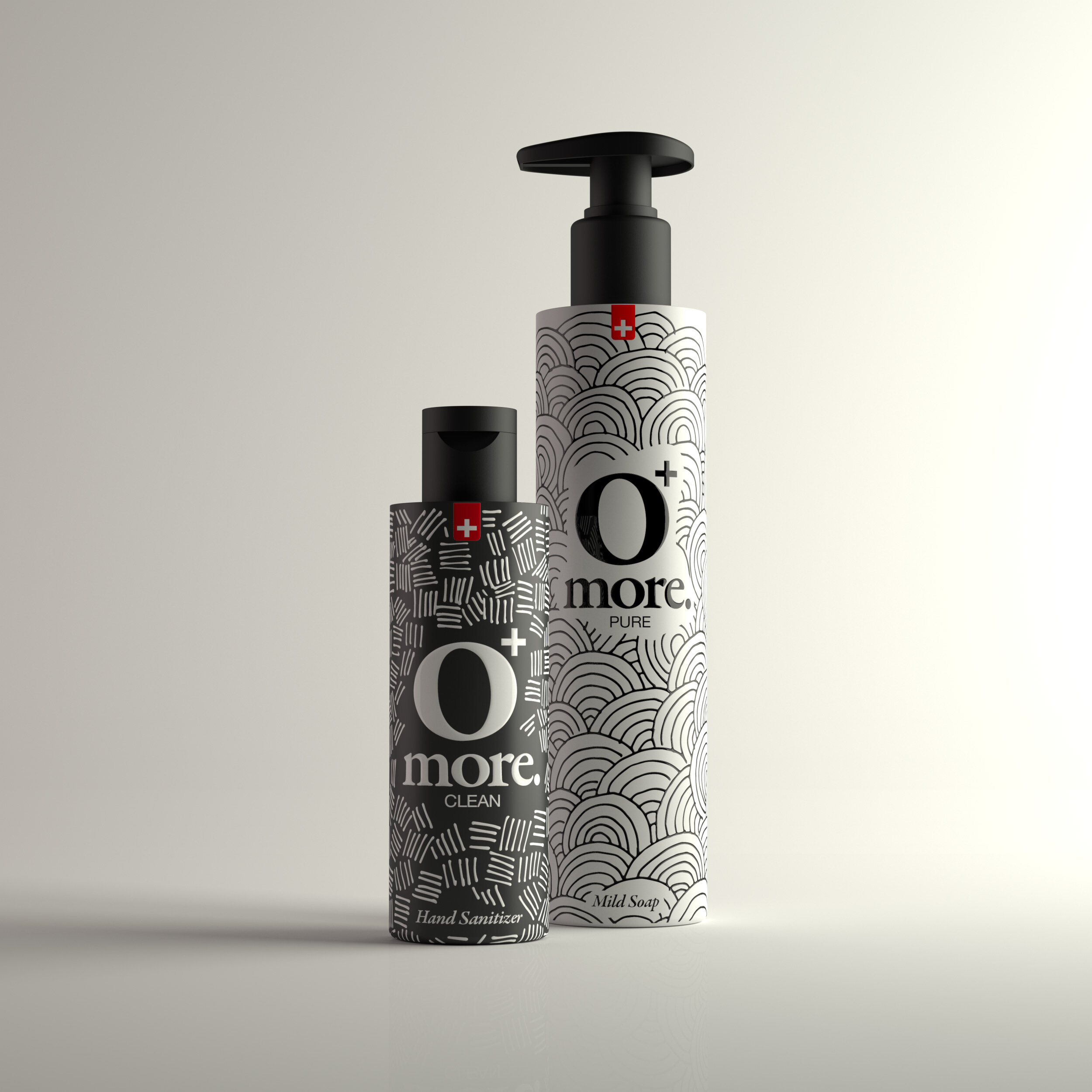
More than a packaging.

In the field of cosmetics, packaging plays a fundamental role, it is the tangible mediator between an anonymous chemical compound and the user. It not only tells its own content, but conveys and expresses the values ​​of the brand, suggesting particular purchasing and use dynamics according to how it is thought. In addition to designing the graphics that accompany the products on the primary packaging and on the cardboard packaging, the project has engaged us in the selection of the type of packaging, materials, overpacks, seals and all those artefacts necessary for transport, storage, distribution , promotion, sale, use and disposal of the product.

PRO4.jpg
PRO2.jpg
PRO3.jpg


Previous
Previous

Tung

Next
Next

Minottiitalia